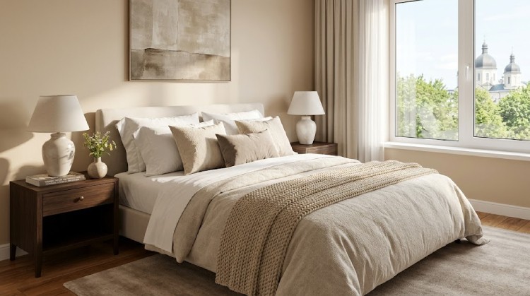
Beige walls seem like an easy starting point until you begin choosing textiles. Beside one beige, white bedding looks fresh; beside another, it feels too cold. Gray can add definition or make the room look dull, while brown can create handsome contrast or turn everything into one continuous beige-brown field.
The reason is simple: beige is not one color. It can lean yellow, pink, gray, green, or nearly neutral. A useful bedding palette therefore begins not with a fashionable photograph but with a careful look at your walls, flooring, and daylight.
The short answer
Warm beige is easiest to pair with ivory, caramel, olive, and terracotta. A cooler gray-beige, often called greige, works well with soft white, dusty blue, and graphite. If the beige appears fairly neutral, most of these palettes can work; the flooring, curtains, and headboard will become the deciding factors.
First, identify the undertone of the beige walls
Look at the wall in daylight with warm artificial lights switched off. Hold up a sheet of white paper, a white pillowcase, or another neutral object. The comparison makes it easier to see where the wall color is leaning.
- Warm beige has a noticeable yellow, peach, or golden cast. It is easiest to combine with ivory, earthy colors, and other natural tones.
- Cooler beige moves toward greige, sometimes with a slight green cast. Muted blues, grays, and cooler whites tend to sit more comfortably beside it.
- Neutral beige looks neither distinctly yellow nor gray. It gives you more freedom, but the palette still needs to relate to the wood, floor, and largest pieces of furniture.
Do not judge the color only by the paint name or an online photograph. Cameras, screens, and bulbs alter color, so the final decision should be tested in the bedroom itself.
A simple formula for styling the bed
Three roles instead of a rigid “three-color rule”
- A quiet base. The sheets and main pillowcases: ivory, cream, pale gray, or a tone close to the walls.
- The leading color. The duvet cover or coverlet—the largest field of color on the bed.
- An accent. A throw or one or two cushions that connect the bed to the curtains, artwork, rug, or chair.
This is not a mathematical formula. If decorative cushions do not suit your life, the accent can be piping on the duvet, a folded throw, or a pattern on one pillowcase.
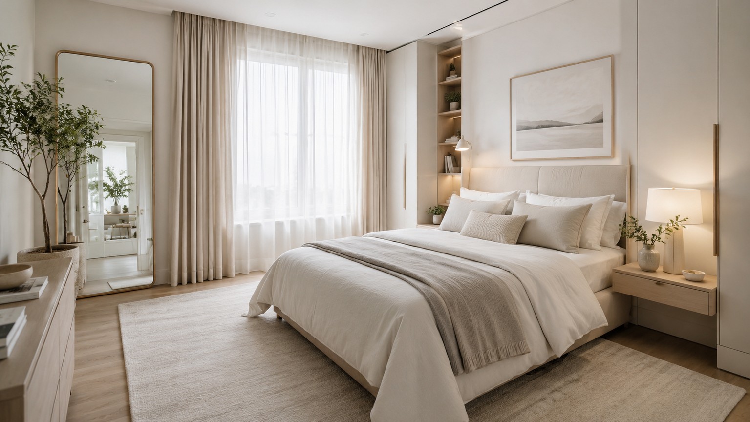
1. Ivory, linen, and oatmeal: a warm monochrome
This palette suits a bright bedroom where you want softness without the hard contrast of optic white. It works particularly well with warm beige, light wood, and gentle daylight.
- Base: ivory or cream sheets.
- Leading layer: a duvet in unbleached linen, oatmeal, or pale sand.
- Accent: caramel piping, a light brown throw, or one muted blue cushion.
Keep the bed from merging into the wall by varying texture as well as color. Matte cotton, linen, a quilted coverlet, and a small wool throw create more depth than six nearly identical beige cushions.
2. Chocolate, caramel, and cream: warm contrast
Dark brown gives a beige room a visual anchor, especially when the interior already includes walnut furniture, a dark headboard, or brown flooring. To keep the bedroom from feeling heavy, confine the darkest shade to one substantial piece or two small accents.
- Base: cream or pale beige sheets.
- Leading layer: a caramel, tobacco, or medium-brown duvet cover.
- Accent: a chocolate throw, piping, or a single bolster cushion.
You do not need glossy satin to make the room feel considered. Practical quality begins with fiber content, a texture you enjoy, and care instructions that fit your routine. Sateen describes a weave rather than a fiber, so check the composition label instead of relying on the finish name.
3. Sage, olive, and sand: a natural palette
Muted greens support beige without creating a sharp contrast. They work comfortably with wood, rattan, linen, and houseplants, but the room does not need to become a themed “eco interior.”
- Base: ivory, pale sand, or warm white.
- Leading layer: a sage or gray-green duvet.
- Accent: an olive throw, dark green piping, or one unbleached linen cushion.
If the walls have a noticeable pink undertone, test the green in the room first: a very clear green may exaggerate the contrast. A grayed sage is generally easier to integrate.
4. Dusty blue, chocolate, and soft white
Blue introduces a cooler note, while chocolate connects it back to the warmth of beige walls. This is useful when the room already combines warm wood with cooler metal or gray details.
- Base: soft white or very pale greige.
- Leading layer: a dusty blue, blue-gray, or faded denim duvet.
- Accent: a chocolate throw, brown piping, or one caramel cushion.
Avoid combining icy blue, optic white, and a yellowish beige without testing them together; the three can look unrelated. Softer, slightly grayed colors are easier to connect.
5. Terracotta, dusty rose, and oatmeal
This is a warm palette with visible color but little harshness. It suits beige walls with peach or golden undertones and works naturally with warm wood.
- Base: oatmeal, cream, or pale sand.
- Leading layer: muted terracotta, clay, or dusty rose.
- Accent: a deeper rust throw, burgundy piping, or a small chocolate cushion.
To prevent the room from feeling overtly autumnal, keep part of the bed light and do not repeat terracotta on every object. One large colored layer and one smaller echo are enough.
6. Graphite, mustard, and warm white
Graphite adds a clean graphic edge, while mustard keeps the combination from becoming too cold. This palette is strongest with neutral or gray-beige walls, black lighting, and furniture with simple lines.
- Base: warm white or pale gray.
- Leading layer: a medium-gray or graphite duvet or quilted coverlet.
- Accent: one mustard cushion, a narrow throw, or a small-scale pattern.
Mustard works here as an accent. If the duvet, curtains, rug, and accessories are all yellow, the beige walls can no longer act as a quiet background.
Which palette suits your bedroom?
Choose the result you want
How to use this guide: select a row or its arrow to expand the recommendation.
I want a light, quiet bedroom
Start with palette 1: ivory, linen, and oatmeal. If the walls are cooler, replace cream with soft white and bring in a little greige.
I want darker contrast
Choose chocolate palette 2 for a warmer interior. For a cooler, more graphic result, use graphite palette 6.
I want color without brightness
Sage palette 3 feels more natural, while dusty blue palette 4 feels fresher. Test both beside the wall in daylight.
I want the bedroom to feel warmer
Try terracotta palette 5 or caramel-and-chocolate palette 2. Keep the sheets and main pillowcases light to preserve balance.
What else to consider before buying
- Care. If children or pets use the room, a washable removable coverlet is more useful than a complicated arrangement of decorative cushions.
- Season. You do not need to replace the entire color scheme: add a wool or quilted layer in winter and return to lighter cotton or linen in summer.
- Pattern. If the curtains or wallpaper are already active, keep the bedding quieter. With plain walls and curtains, a stripe, check, or small botanical motif can work.
- Quantity. The bed does not need ten cushions if they end up on the floor every night. Keep only the layers you actually use.
If the wall behind the bed still feels empty after the textiles are chosen, treat that as a separate design task. The LINES has a dedicated guide to wall decor without a major remodel.
Conclusion
Begin with the wall undertone rather than the name of a fashionable color. Then choose a quiet base, one leading shade, and a small accent. This order helps the bedroom read as one composition instead of a collection of individually attractive purchases.
The best palette is not the one that promises an “expensive look.” It is the combination that works in your light, relates to the furniture you already own, and remains convenient in daily life.